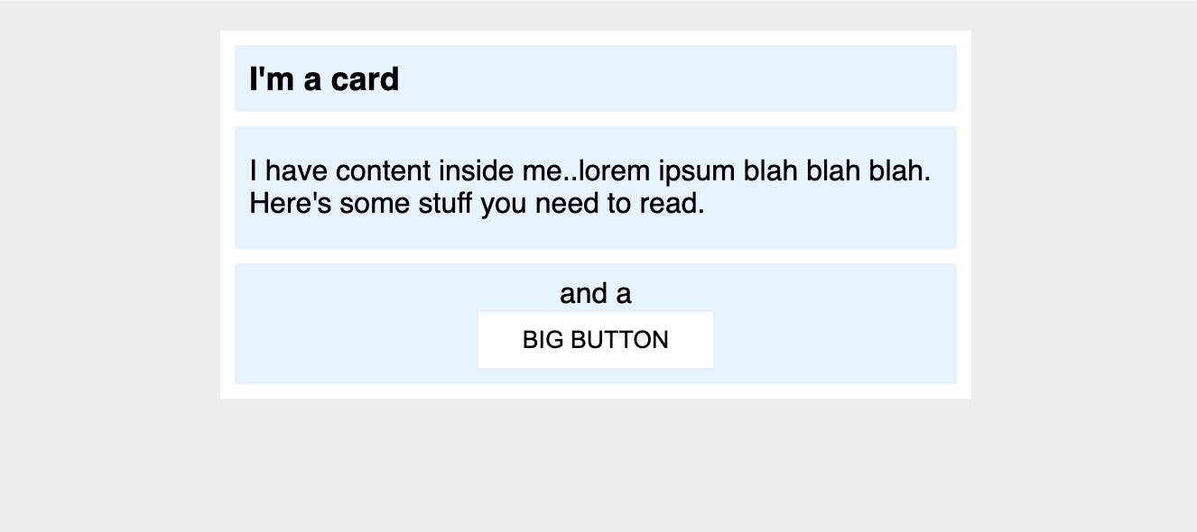
# Margin and Padding #2 This one is a little nicer looking, and a little closer to something you might see in the real world. You'll need to change a little more than just margin and padding to make it look exactly right. ## Desired outcome  ### Self Check Use this section to check your work. On _these_ projects, your goal isn't to attain 100% pixel-perfection, but to use the tools you've learned to get relatively close to the desired output. - There is 8px between the edge of the card and it's content (the blue sections). - There is an 8px gap between each of the blue sections inside the card. - Title of the card uses a 16px font. - There are 8px between the title text and the edge of the title section. - The content section has 16px space on the top and bottom, and 8px on either side. - Everything inside the `.button` section is centered, and there is 8px padding. - the Big Button is centered on it's own line. - the Big Button has 24px space on the sides, and 8px on top and bottom.