| .. | ||
| solution | ||
| desired-outcome-narrow.png | ||
| desired-outcome-wide.png | ||
| index.html | ||
| README.md | ||
| style.css | ||
Responsive Holy Grail Layout with Grid
This one is easy! We are going to take our Holy Grail Layout from the first exercise and make it responsive. To do this we will simply change our fixed track sizes to be dynamic. Consider this a warmup for the next exercise and make sure your layout is responding properly when resizing the browser window.
Hints
- You only need to add to the CSS selectors
- Use dynamic track sizes for your columns and rows
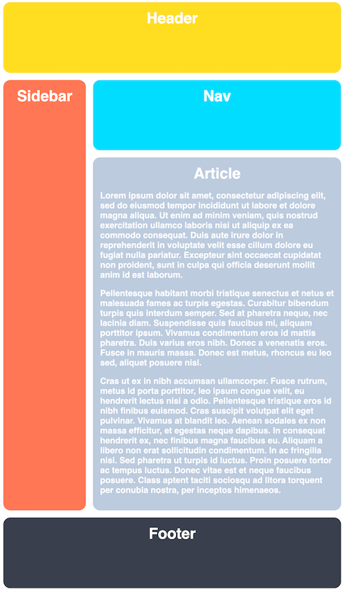
Desired Outcome
When the browser is narrow:
When the browser is stretched wide:
Self Check
- The gap is 15px
- The grid has two columns
- The grid has four rows
- The grid tracks do not use static sizes (no pixels!)
- The first column is three times larger than the other
- The third row is five times larger than the others
- The rows and columns stretch wider when making the browser window bigger
- The rows and columns stretch taller when making the browser window smaller

