| .. | ||
| solution | ||
| desired-outcome.gif | ||
| index.html | ||
| README.md | ||
| script.js | ||
| style.css | ||
Popup
Popup modals are great for replacing the standard window popups that we often fall back on when we want our users to confirm something, or log in, etc.
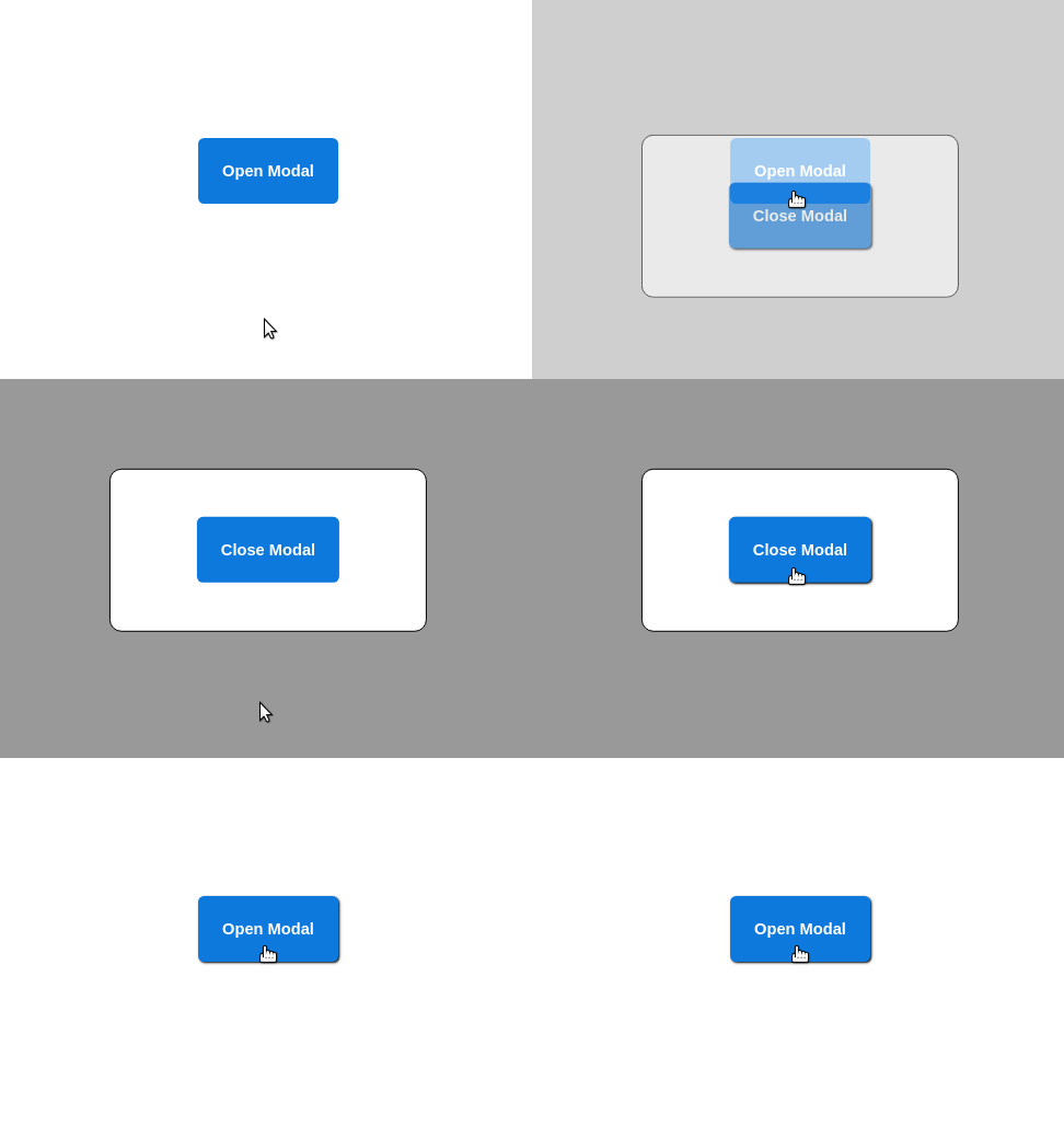
In this exercise, activate a popup modal that will appear when the user clicks on the 'Open Modal' button and disappears when they click on the 'Close Modal' button inside the popup.
The modal should smoothly fade in and slide up to cover the Open button. The background should darken a little to create a clear distinction between foreground and background, and a little shadow should appear on the buttons when you hover over them.
When you're done, keep this repo handy! Being able to build a custom modal is a great show-off for your future projects.
Hints
- There's a little Javascript here. Don't worry about it. It's been set up to add/remove the
showclass to the relevant elements when clicked - Multiple transitions will be required
- Pay close attention to the elements being altered with classes being added or removed
Desired Outcome
Self Check
- The mouse cursor changes to a pointer over the buttons
- A drop shadow gets added to the buttons when the mouse hovers over them
- The popup modal appears when the Open button is clicked
- The background fades to black with 40% opacity when the popup is opened
- The popup smoothly slides up to cover the existing Open button
- When the Close button is clicked the popup modal slides back down and gradually disappears
- When the popup modal is hidden your mouse should not change to the pointer if hovered over an invisible Close button
