| .. | ||
| solution | ||
| desired-outcome.png | ||
| index.html | ||
| README.md | ||
| style.css | ||
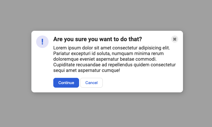
A common 'modal' style
This one is another very common pattern on the web. The solution to this one is simple... but it might not be immediately obvious to you. You'll need to edit the HTML a bit to get everything where it needs to be.
A hint
Depending on how you approach this one, you might need to revisit the flex-shrink property to keep a flex item from getting smashed. In addition, pay attention to the structure of the html, specifically look into adding an additional container surrounding the header, button, main text, cancel, and continue divs; and look into moving the header div to encompass the button as well.
Desired outcome
Self Check
- The blue icon is aligned to the left.
- There is equal space on either side of the icon (the gaps between the icon and the edge of the card, and the icon and the text, are the same).
- There is padding around the edge of the modal.
- The header, text, and buttons are aligned with each other.
- The header is bold and a slightly larger text-size than the text.
- The close button is vertically aligned with the header, and aligned in the top-right of the card.
