| .. | ||
| solution | ||
| desired-outcome.png | ||
| index.html | ||
| README.md | ||
| style.css | ||
The Holy Grail Layout with Grid
Now it's time to practice the Grid tools we've learned and create a layout that might seem familiar. We're going to make a Holy Grail Layout like the ones we created using Flexbox. The difference here is that we won't be relying on Flexbox for this exercise. We'll only be using Grid. You'll be able to see the benefits of Grid for yourself!
Hints
- You only need to add to the CSS selectors
- Look back to the Creating a Grid lesson if you forget how to turn an element into a grid
- Use fixed track sizes (e.g. pixels) for your columns and rows
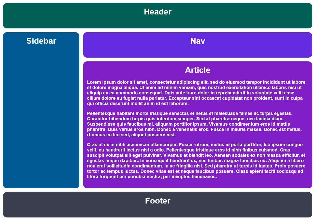
Desired Outcome
Self Check
- The gap is 15px
- The grid has two columns
- The grid has four rows
- The second column is three times larger than the first
- The third row is five times larger than the others
- The header and footer elements span across both columns
- The sidebar element only spans across the first column
- The nav and article elements span across the second column
