2.4 KiB
Frontend Mentor - Product preview card component solution
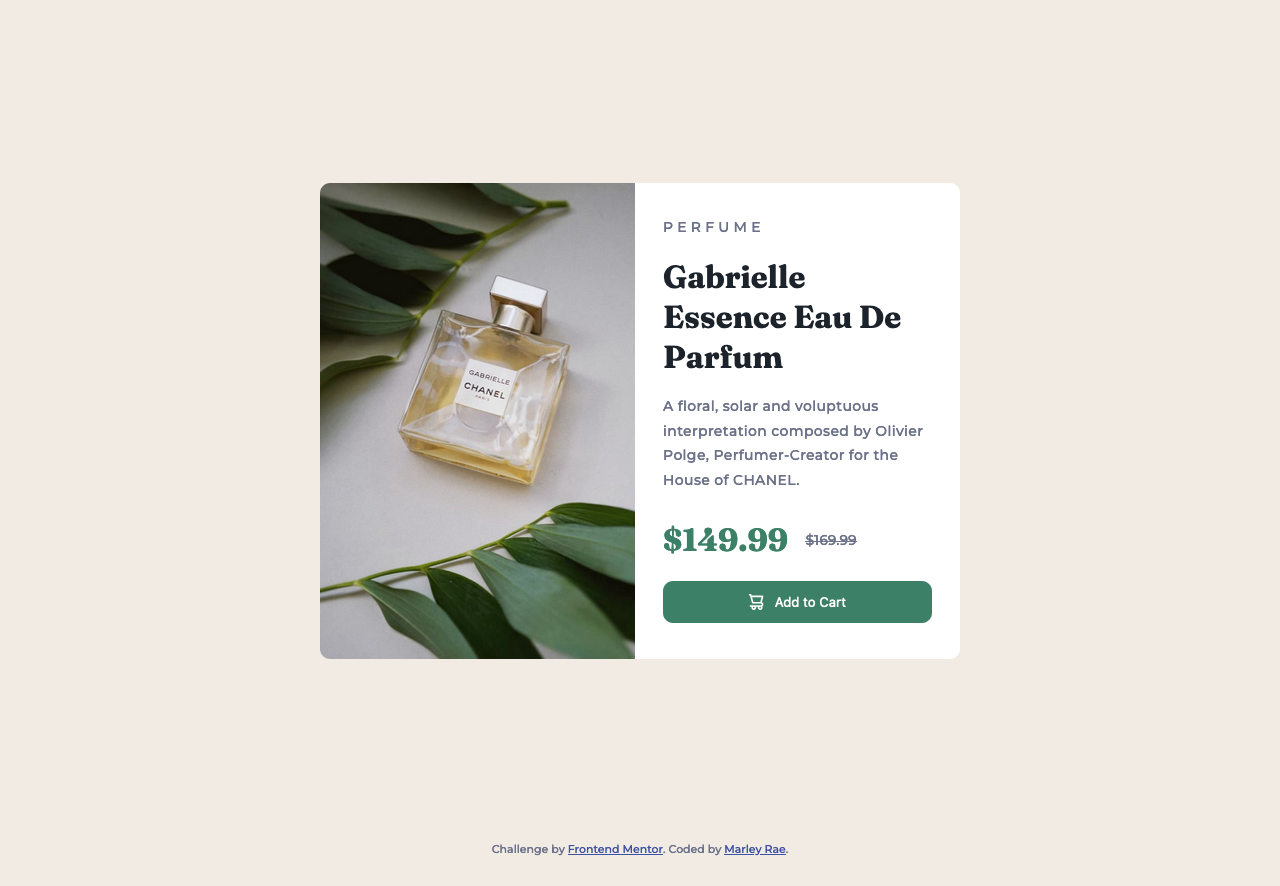
This is a solution to the Product preview card component challenge on Frontend Mentor. Frontend Mentor challenges help you improve your coding skills by building realistic projects.
Table of contents
Overview
The challenge
Users should be able to:
- View the optimal layout depending on their device's screen size
- See hover and focus states for interactive elements
Screenshot
Links
My process
Built with
- CSS/HTML
- Vite.js
What I learned
How to use a <picture> element and set images differently based on media queries:
<picture>
  <source media="(max-width: 999px)" srcset="images/image-product-mobile.jpg">
  <source media="(min-width: 1000px)" srcset="images/image-product-desktop.jpg">
  <!-- <img> is required! Src is set to fallback img -->
  <img
    src="images/image-product-desktop.jpg"
    alt="Gabrielle Essence perfume bottle"
    class="ProductCard-picture"
  >
</picture>
Additionally, does not automatically shrink-wrap to its , so CSS is required to keep from creating extra spacing:
.ProductCard-picture {
    height: 100%;
}
Useful resources
I've known about BEM for a long time, and more recently came across SUIT CSS. For a while I've used a sort of hybrid, as I liked the spacing of BEM's syntax (block__elem vs block-elem), but prefer SUIT's seperation of modifier & state. For this project though, I decided to try conforming fully to SUIT and found I actually really liked it.
Author
- Website - Marley Rae
- Frontend Mentor - @punkfairie
Note: Delete this note and add/remove/edit lines above based on what links you'd like to share.
