1.2 KiB
1.2 KiB
An entire page!
Flexbox is useful for laying out entire pages as well as the smaller components we've already been working with. For this exercise, we're leaving you with a little more work to do, with some things you may not have encountered yet. It's perfectly acceptable to google things you're unsure of!
Hints
- you may want to search something like
CSS remove list bullets. We've done this for you in previous examples, but not here. Yay learning. - We've added
height: 100vhto thebody.. this makes the body exactly the same height as the viewport. To stick the footer to the bottom you will need to use flex and change the direction to column.
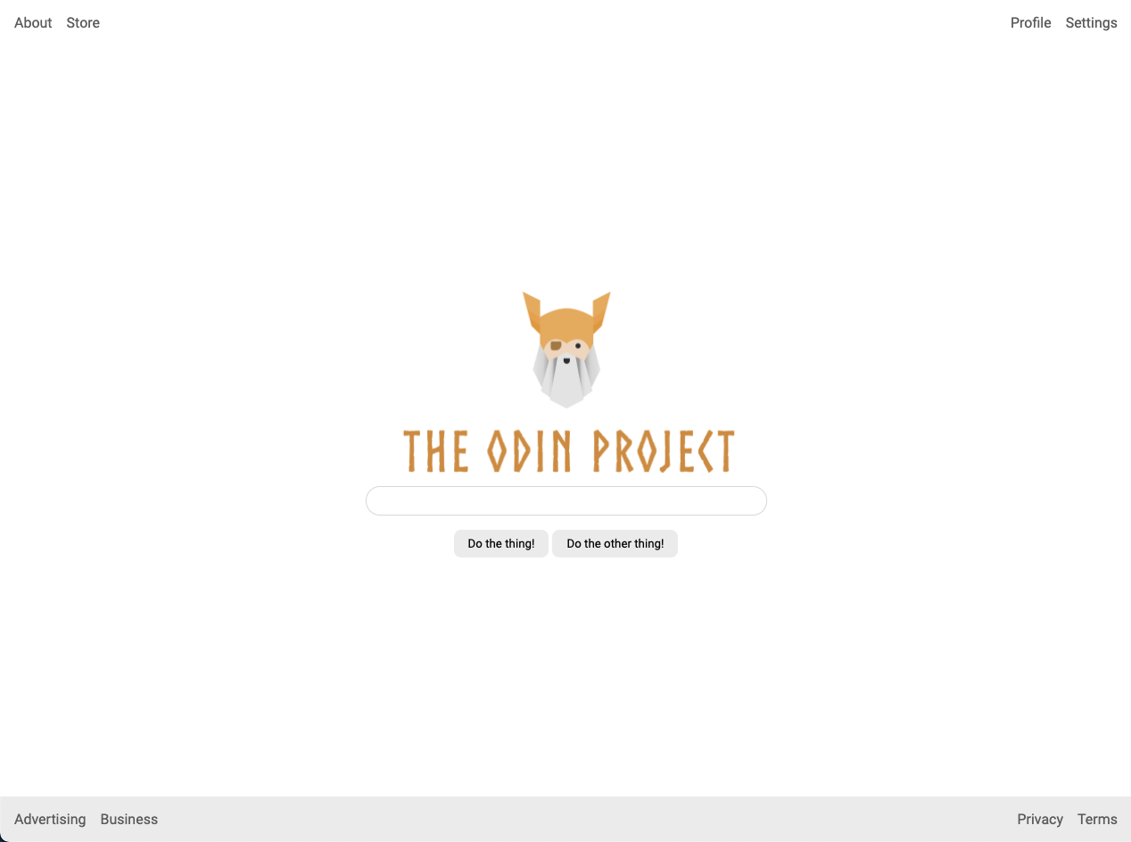
Desired Outcome
Self Check
- Header is at the top of the page, footer is at the bottom and they stay in place if you resize your screen.
- Header and footer have padding.
- Links in header and footer are pushed to either side.
- There is space between the links in the header and footer.
- Footer has a light gray background (#eeeeee).
- Logo, input and buttons are centered in the screen.
- Buttons have an appropriate amount of padding.
- There is space between the logo, input and buttons.
